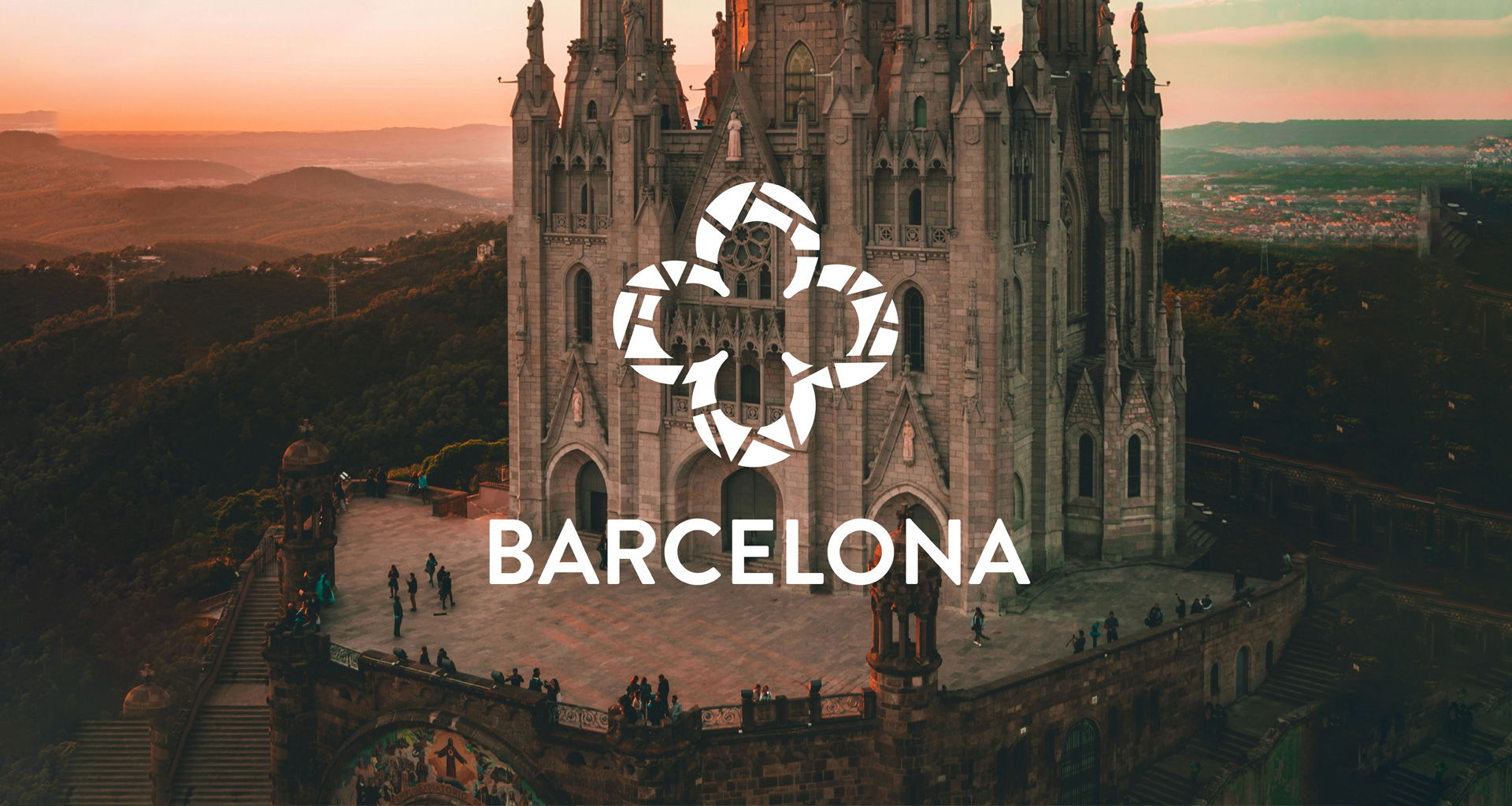
Tourism Logo: Barcelona
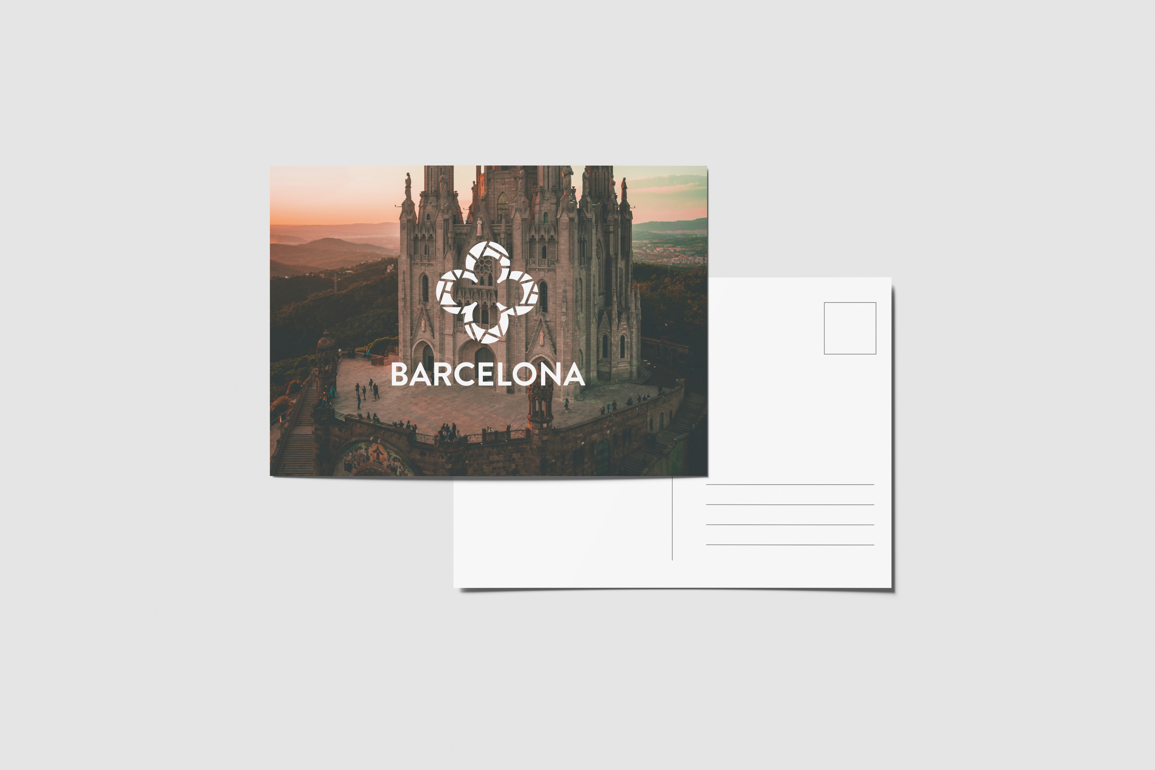
Crafting a logo for Barcelona that resonates with both locals and tourists.
The Challenge
This project tasked me to create a logo for an international city that embodied its spirit, arts, culture, history and present.
The Solution
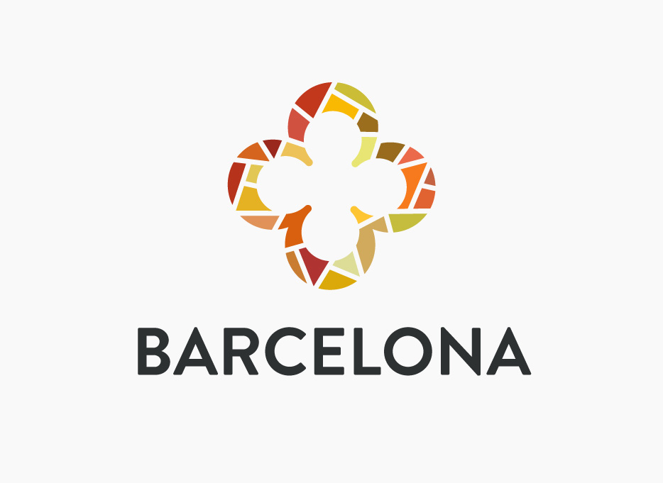
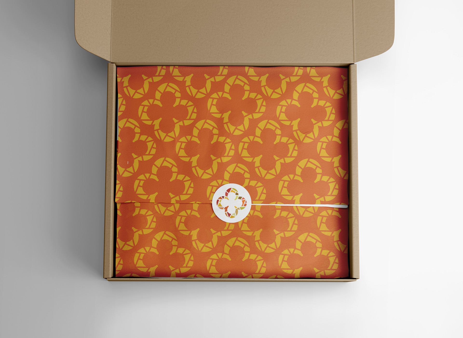
The challenge was to pinpoint a symbol capable of embodying an entire city. It was difficult veering away from the predictable but giving enough to make an impact. After delving into pivotal aspects of their art, history, and culture, I discovered the panot symbol, prevalent in tiles across the city. My research also unveiled the abundant presence of mosaics. From here, I fused the mosaic concept with the iconic panot symbol to craft Barcelona's tourism logo.
BRAINSTORM
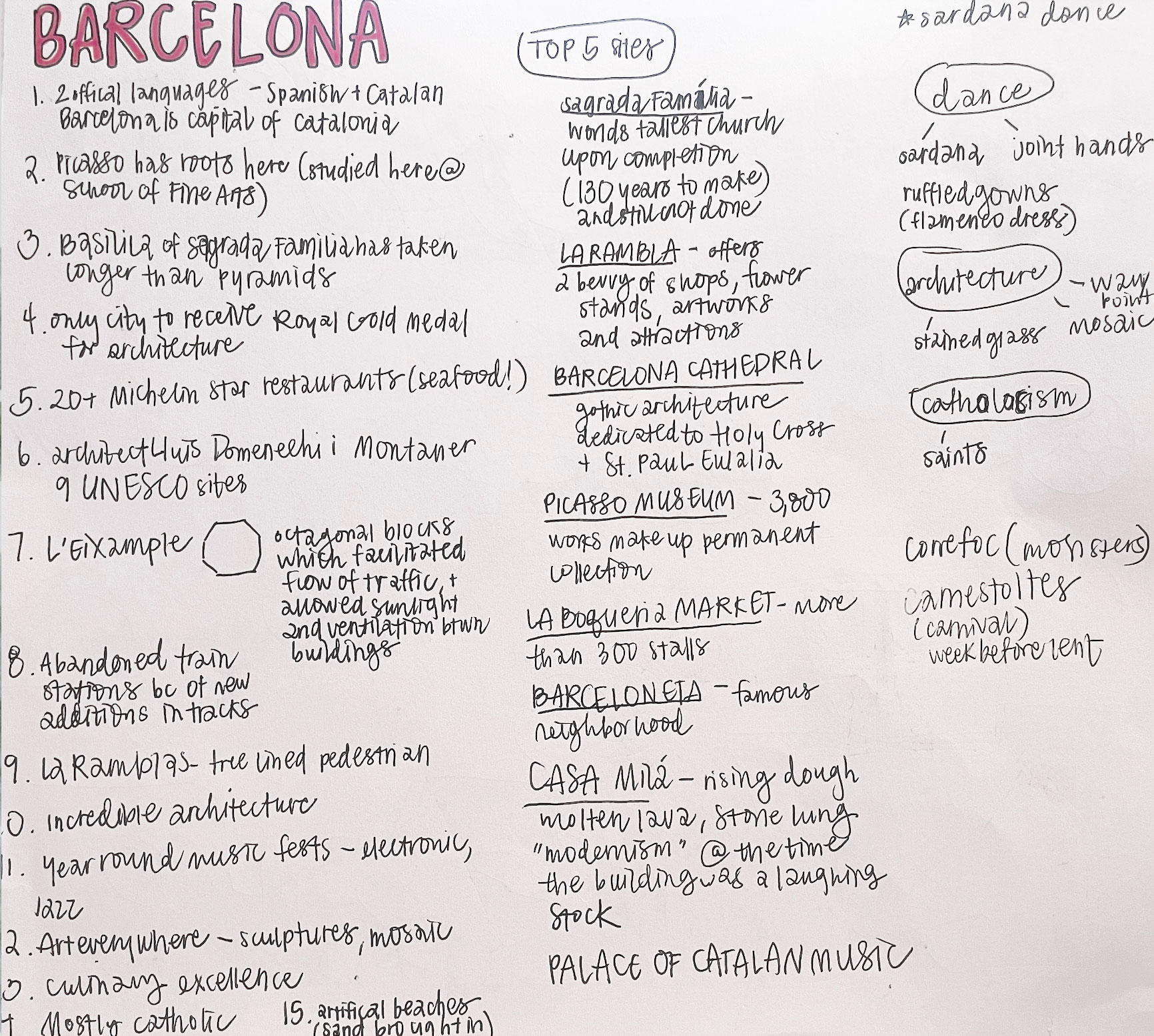
Initially, I delved deeply into Barcelona's culture and history. Without preconceived notions clouding my perspective, my aim was to understand the essence of its people and traditions. I started with jotting down notes and creating a word-map to explore significant aspects of the city.
SKETCHING
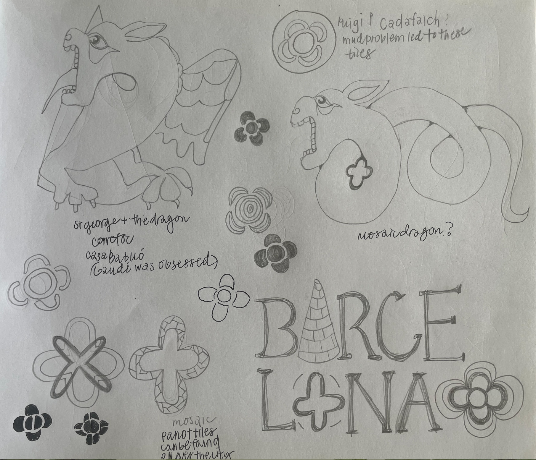
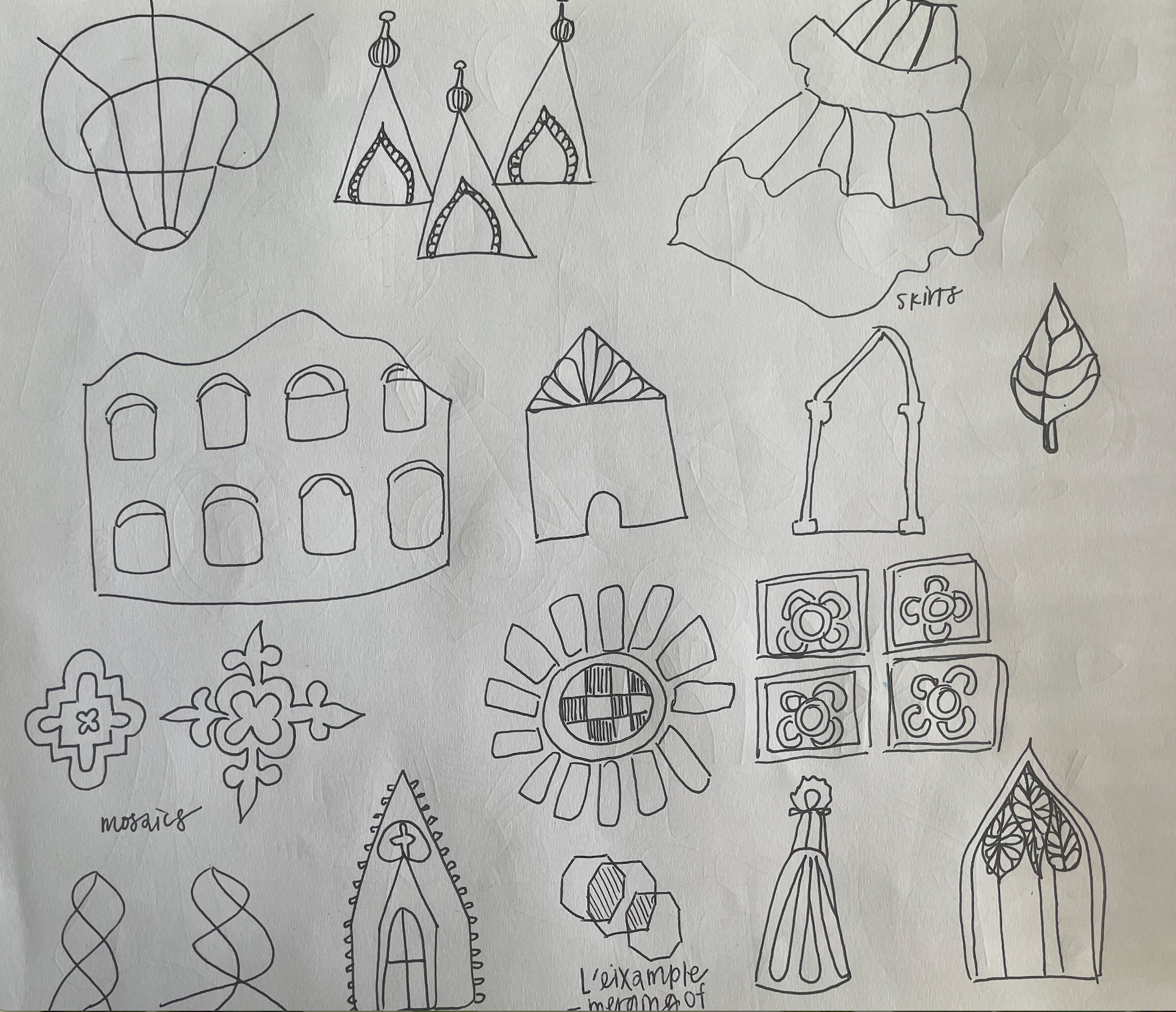
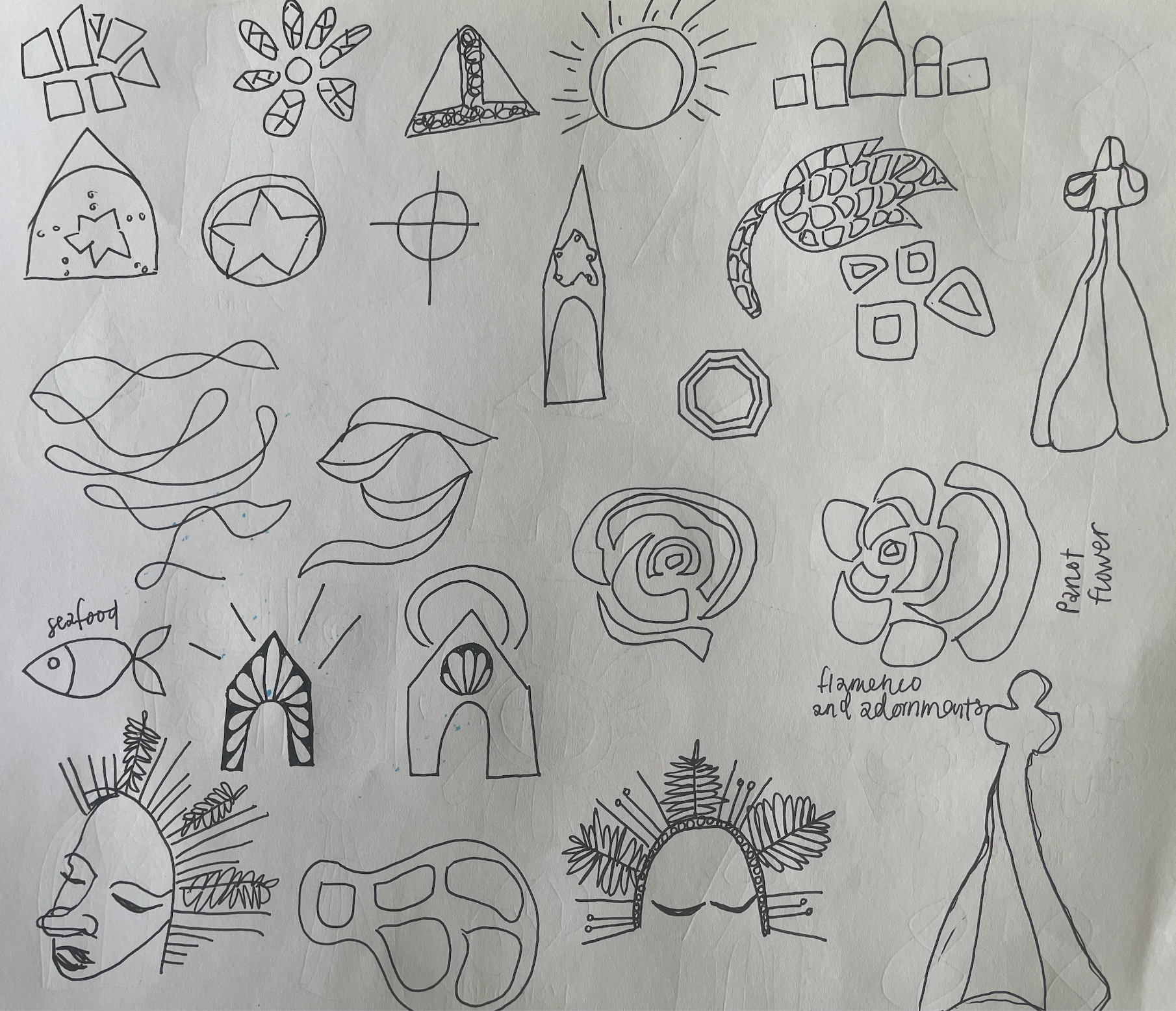
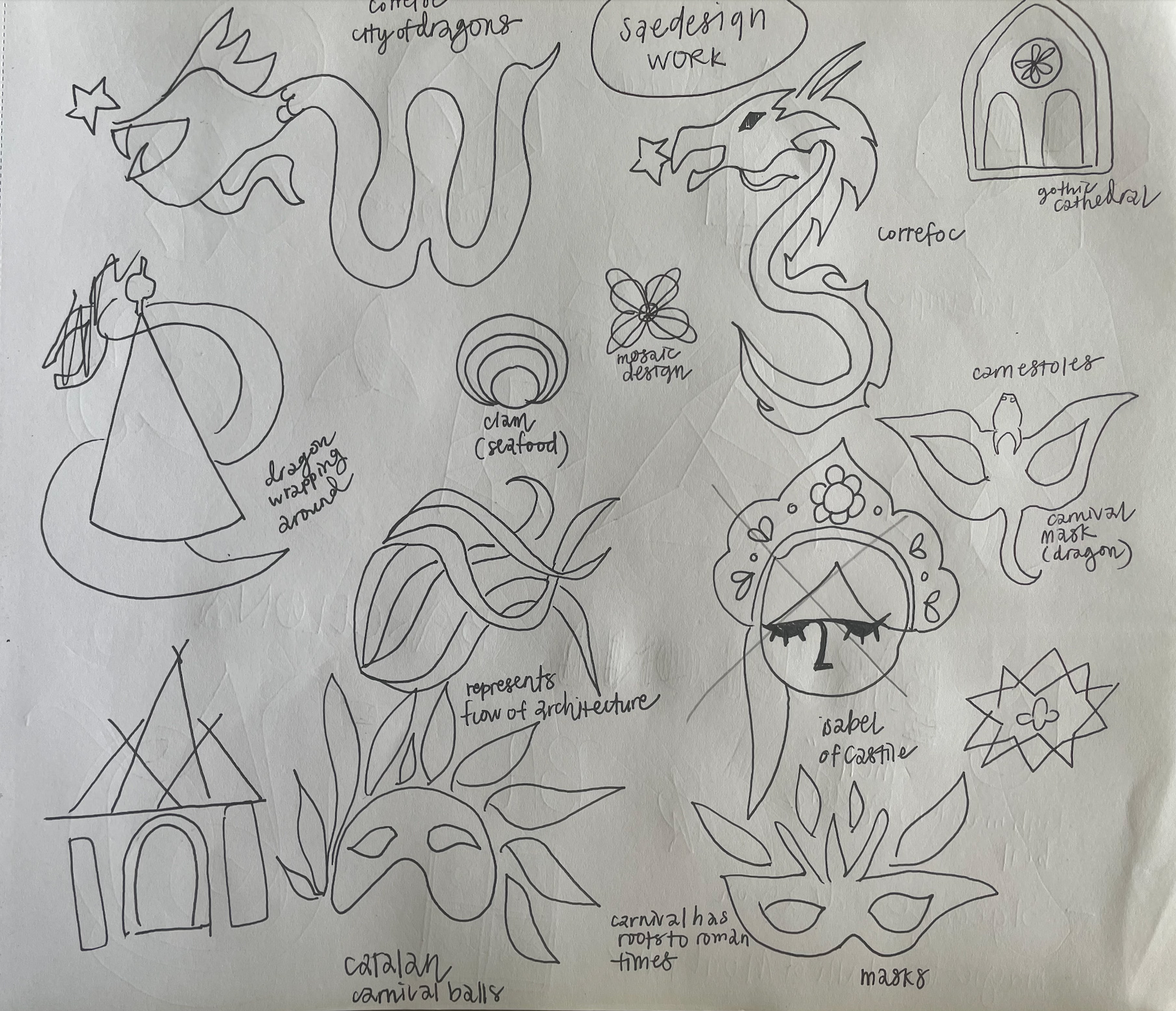
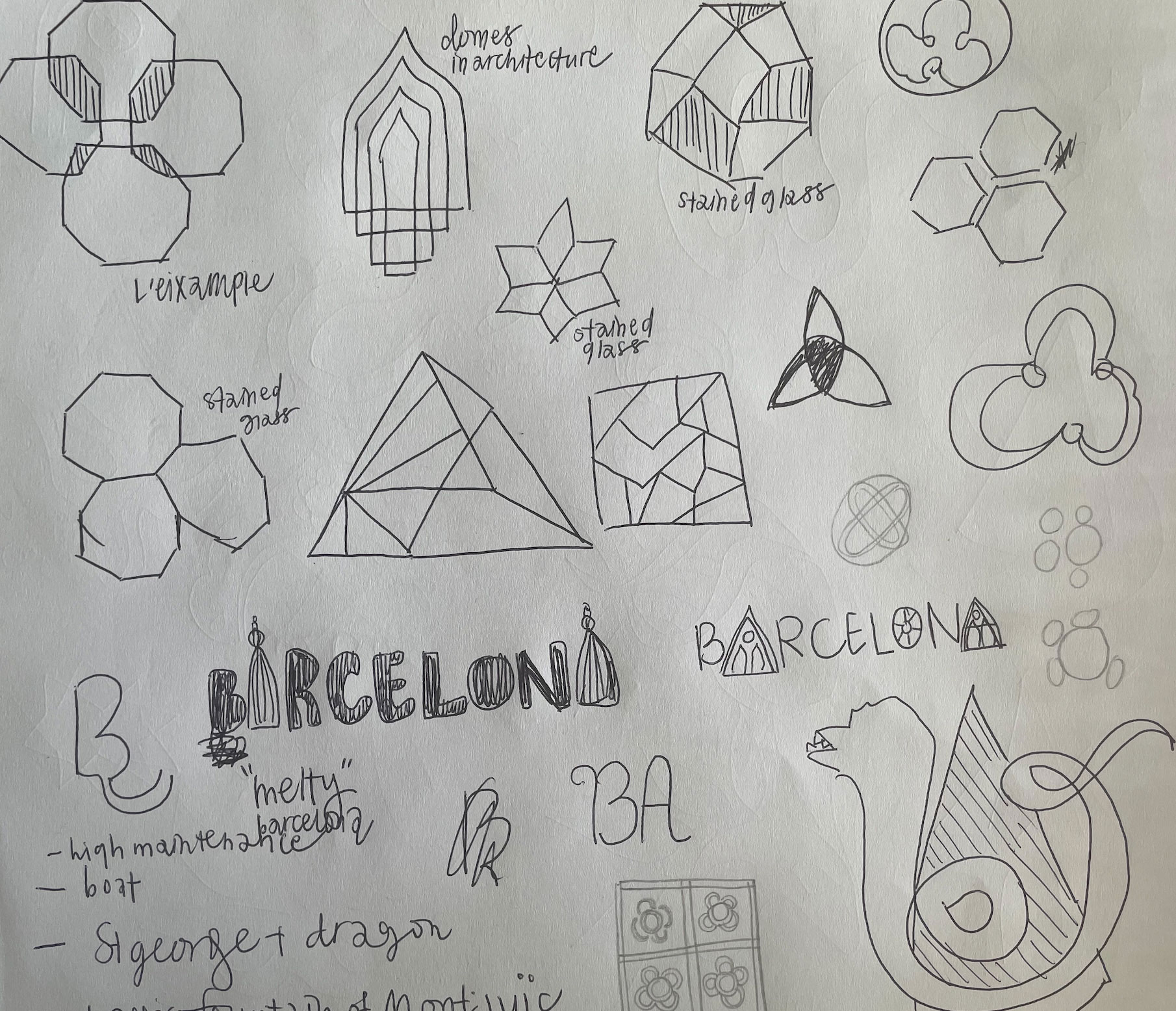
These visuals offer a snapshot of my creative process, displaying various sketches and experimentation until I found strong concepts to hone in on.
ITERATIONS
From my sketches, I selected three compelling concepts and translated them into Illustrator. For the final logo, I opted for the concept I felt was the most unique to the city.

COLOR ITERATIONS
I experimented with vibrant colors that could be found around their city. In the end, I chose the logo that featured analogous colors.

