Editorial Design
Pages that dazzle and delight.
The Challenge
My task was to design magazine layouts, where I explored the interplay of color, typography, layout, color palettes, grid systems, and white space, drawing inspiration directly from the content to shape the design. My main aim was to convey information in a clear but engaging manner.
The Solution
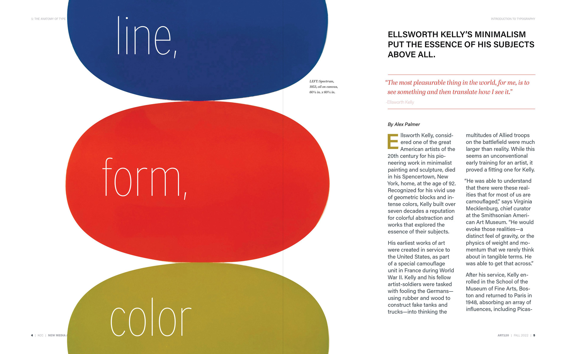
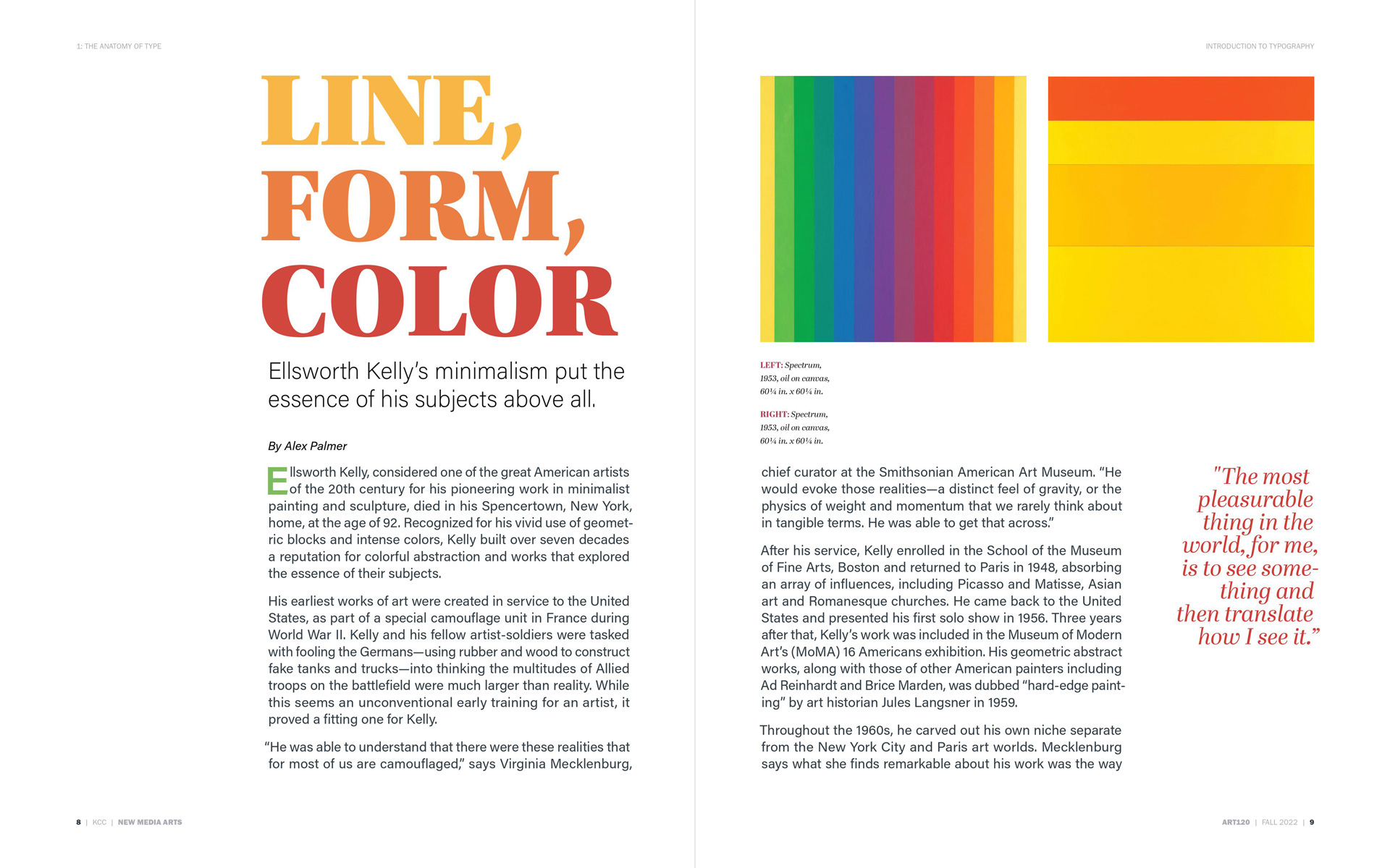
Line, Form, Color
In this design process, I used the content to guide the layout, color and typography.
Discovering that Ellsworth Kelly was a printmaker associated with hard-edge painting, color
field painting, and minimalism—I designed aiming to emphasize line, form, and
color minimally.
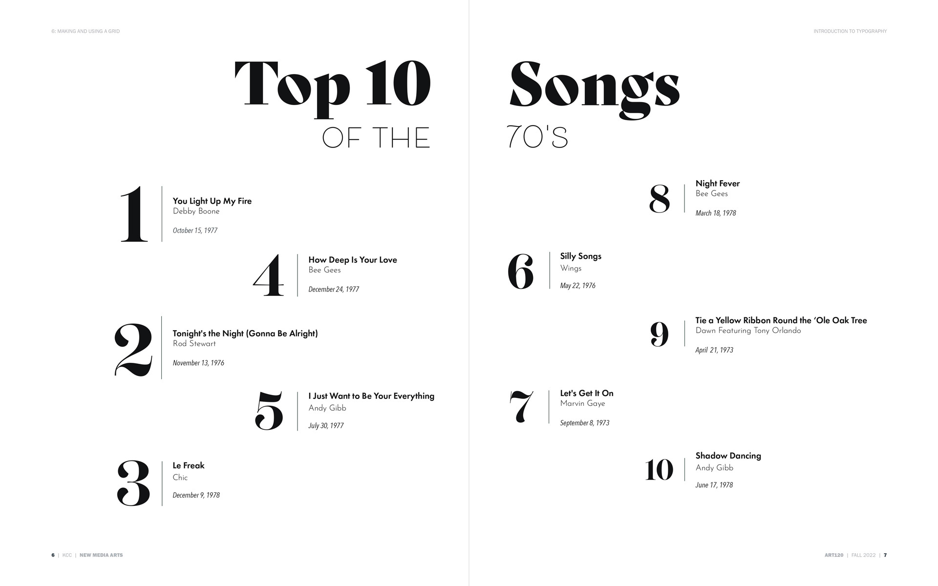
Top 10
I aimed to highlight and manipulate the numbering within the content, aligning with the
concept
of a popularity-based list. Creating hierarchy with the type also helped create texture and
contrast with minimal content.
Tiramisù
In this layout design, the aim was to establish clear hierarchy, distinguishing the
significance of each element: title, subheader, ingredients, notes, and instructions.
Determining the optimal pairing of typefaces, configuring the grid layout, ensuring text
alignment, and maximizing whitespace was a challenge.


