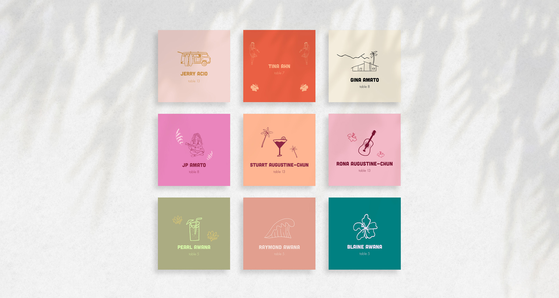
Wedding Print Design
Wedding collateral that made the bride happy (the groom gladly entrusted this task to her).
The Challenge
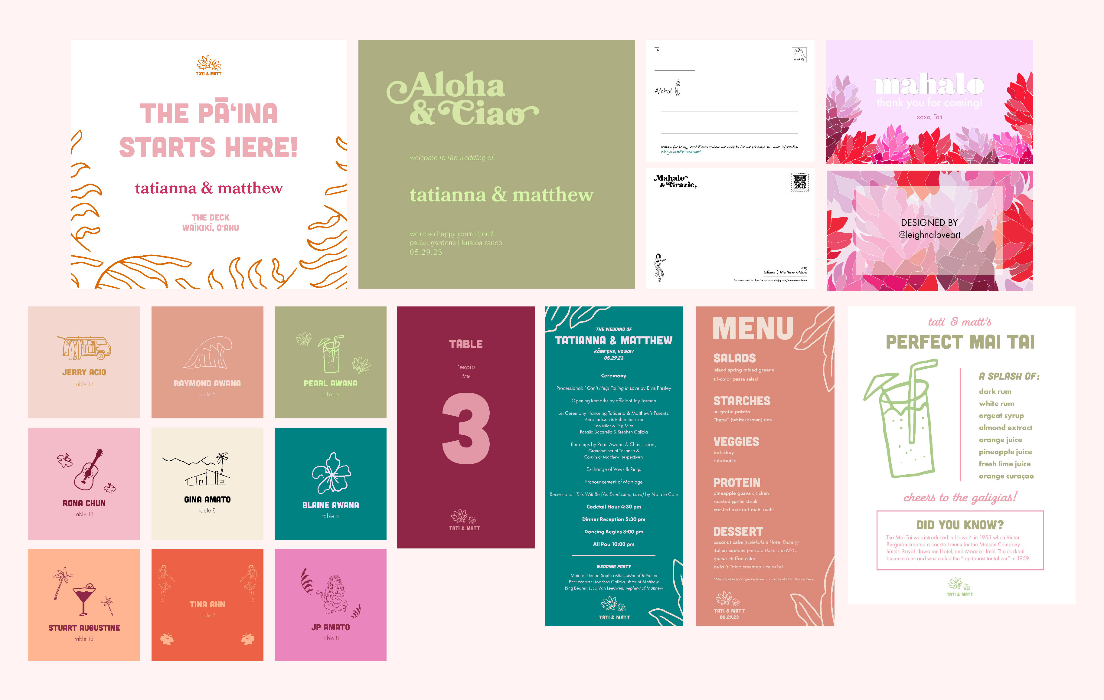
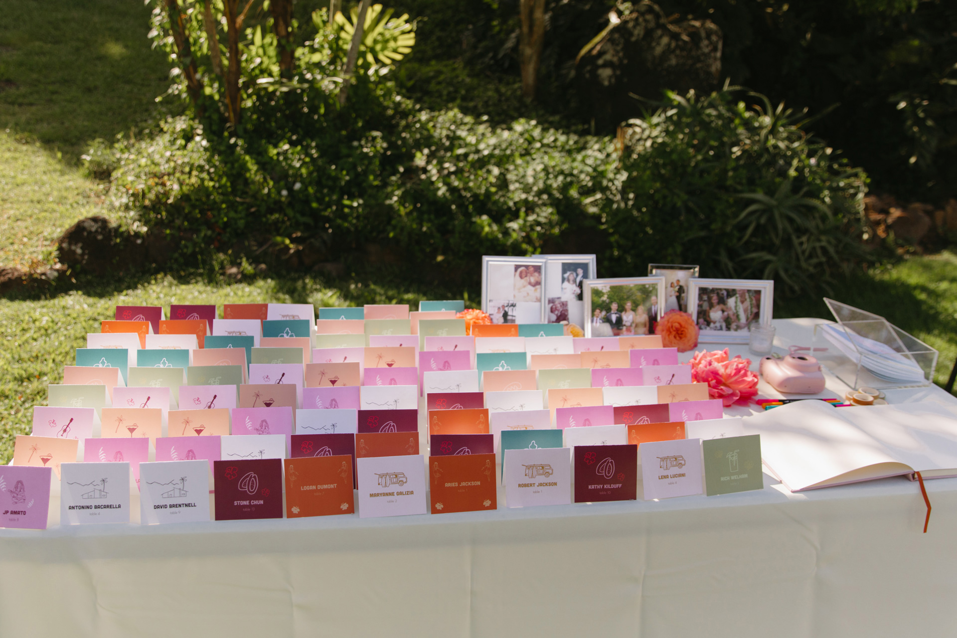
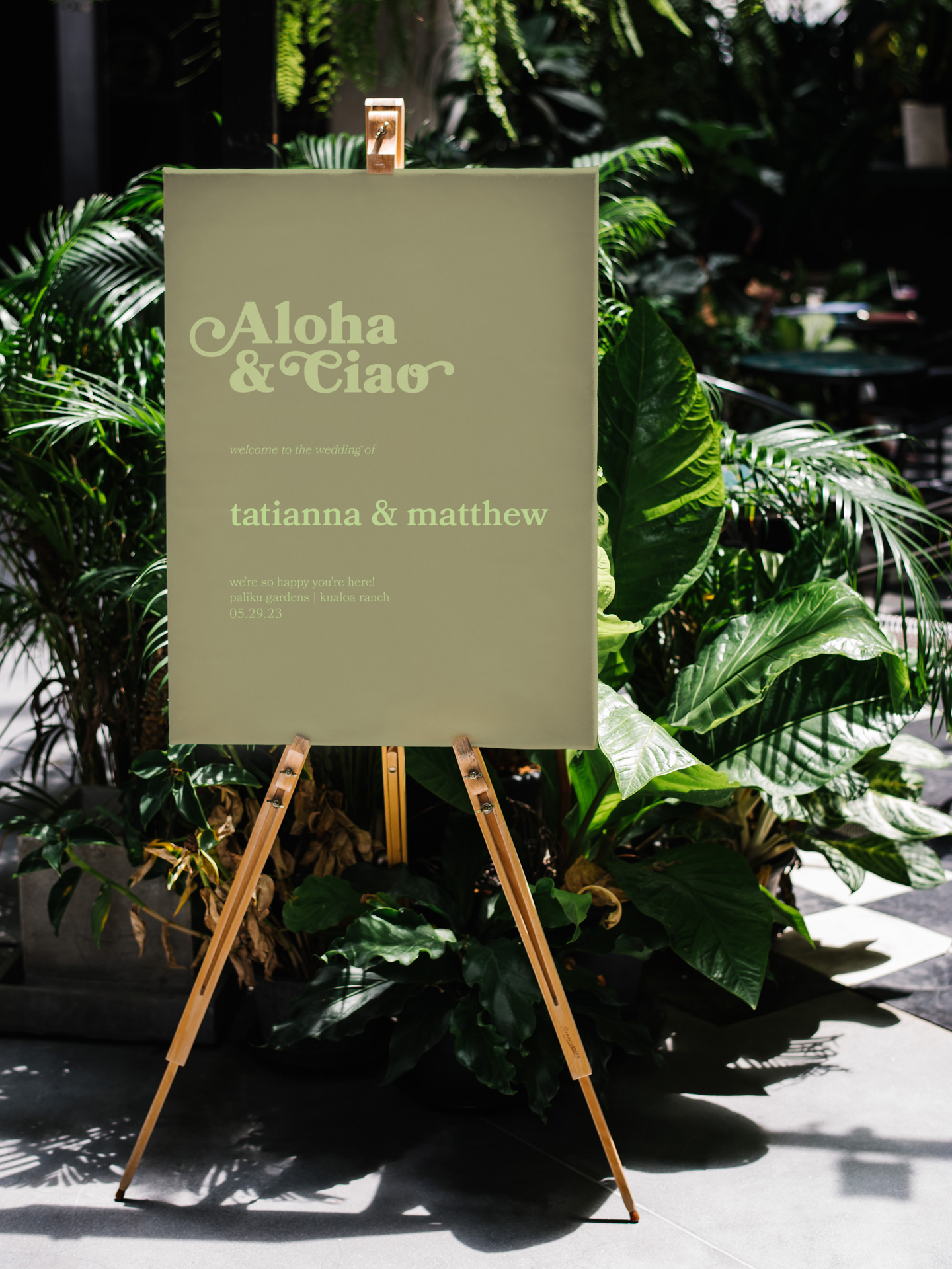
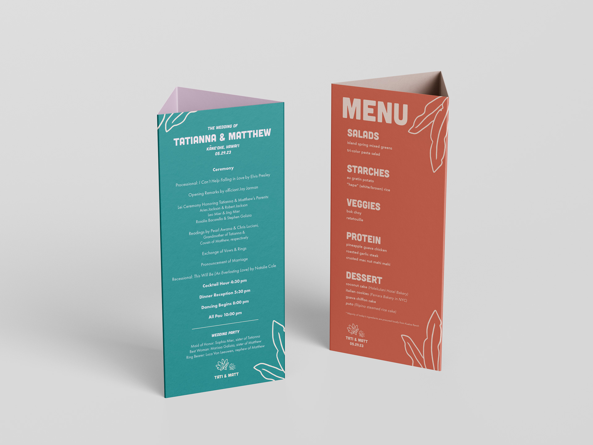
The client requested wedding signage and collateral that not only maintained cohesiveness but also drew inspiration from the vintage Hawaiʻi-themed Save-the-Dates they had previously sent out. They also specified a large color palette to make each piece feel unique.
The Solution
We went through many design ideas and landed on creating the vintage look with typography, color and illustrations. The project hit a snag when we couldn't get high-quality lei photos as requested by the client. I suggested achieving the vintage aesthetic through the use of typography, colors, and found illustrations that were inspired by the golden years of tourism in Hawaiʻi (1920's & 1930's). Navigating the challenge of a diverse color palette, I addressed it by using analogous colors within each piece. However, I maintained a broad range of colors across all printed materials.
